New York
Sub/urbia in Recent Photography
Whitney Museum of American Art
September 30, 2005–January 15, 2006
A small but focused show tucked into the Whitney’s mezzanine collects the work of nine photographers, and despite a potentially overwhelming title, suggests several ways to look at — and ultimately make sense of — contemporary American cities. The photographs don’t attempt to document urban experience, instead finding and creating moments that offer new scenarios, whether real or imagined, fleeting or just overlooked.
Gregory Crewdson’s trademark everyday eeriness is represented by a photo from his Beneath the Roses series (2004). He stages a mysterious nighttime drama on an anonymous Main Street, USA: a car, its door open, is parked below a traffic signal lit yellow. Light flows out from the car and nearby storefronts making the otherwise desolate streetscape seem incongruently porous.
Contrasting Crewdson’s high-production detachment is Corin Hewitt’s deeply personal depiction of small-town life. Also constructed (but in a completely literal sense), herein is a photograph of a model of the interior of two rooms of Hewitt’s grandmother’s house, looking exactly as they did when she died. Every detail in 85 Union Street, Kitchen, January 13, 2002, and 85 Union Street, Living Room, January 13, 2002, is painstakingly depicted in 1/12 scale (and, with a scientific specificity, printed at ¼ scale), from the blueand-white checkered kitchen tablecloth to the crossword puzzle dictionary sitting in the living room. The photos memorialize the woman’s life and offer an intimate glimpse into a distinctively American domestic world.
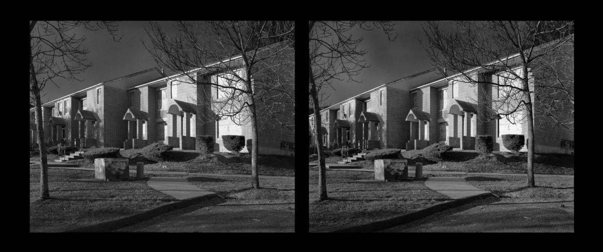
Walead Beshty’s couplet of photography projects, pictures of two government-funded housing projects built on the same site in New Haven, offer a starkly different take on the American home. The pieces are a critique of American urbanism embedded with a host of tangential references. One photograph, The Excursionist Views (Oriental Gardens 1983-, day for night, cinemascope), 20012005, shows banal suburban tract houses, while the other, Architecture is not Sculpture (Paul Rudolph, Oriental Gardens, 1970-1981, doubled, inverted, cinemascopic), 2005, is a stack of unlimited takeaway posters of a complex of stacked, overlapping boxy structures. A blunt caption quotes an unnamed source explaining that the project was experimental, pre-fab, low income housing that was “trucked to the site and dropped in place by crane.” The texts underscore the architect’s interest in formal qualities over more humanistic concerns of public housing, a privileging emphasized in Beshty’s title. As suggested by the dates in the titles, Rudolph’s Oriental Gardens were demolished and replaced with the more traditional housing.

Beshty probes Rudolph‘s (not coincidentally the former dean of the Yale architecture school, and the man responsible for its much-maligned Art and Architecture building) flawed vision and contrasts his irresponsibility with the functional, yet unidealistic version built later. Beshty takes this comparison further by layering his project with references that push into other territories. His carefully descriptive titles indicate the importance of his technique and his appropriation of cinematography. The “day for night” filter, for instance, gives the image the romanticized look of an old movie with any signs of use or decay obscured by the deep, fake night. The building’s superficial decorative aspects are emphasized — the simple building block shapes of the columns, arched triangular overhangs, and planters, all set off in high-contrast shadow. There was also a contrast between the practice of photography and architecture. “Architecture is Not Sculpture,” but photography can be, as demonstrated by the form made by the pile of posters (itself a critique of modernism via Felix Gonzales Torres). Photography jumps the categorical fence in depicting architecture that failed for attempting the same.
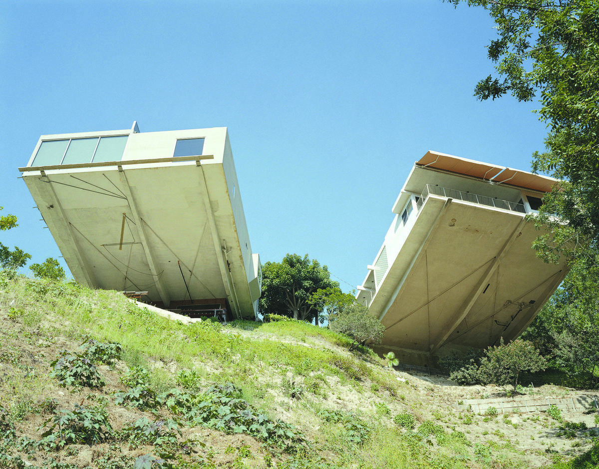
Amir Zaki gives the show the most thrilling portrait of housing Untitled, (OH04X)_ 2004, which pictures two houses hovering over a cliff. Zaki ups the ante on Los Angles delirium by digitally erasing the cantilevered supports below the houses, making them appear as if they are balancing on one edge of the house. It is a thrilling exaggeration that augments the impression of Los Angeles as one big beautiful disaster.