New York
Whitney Biennial: 2010
Whitney Museum of American Art
February 25–May 30, 2010
Most people interpreted curatorial odd couple Francesco Bonami and Gary Carrion-Murayari’s 2010 Whitney Biennial title, ‘2010,’ as equal parts banality and lack of ambition, but I found in it a disguised hope for something watershed, something culturally historic, an experience beyond the reach of language. In its conspicuous inconspicuousness, it was already, inherently, at least somewhat successful.
It is unlikely the show will join the pantheon of calendrical touchstones — think 1776, Kubrick’s 2001, 9/11 — it did quietly set one vastly underappreciated benchmark: for the first time, it included more female artists than male. It was also the second smallest biennial ever. There was a palpable sense of shifting focus or redefinition as one strolled through the museum. Abstraction was limited, the most austere pieces crowded into a single room. What reigned at ‘2010’ was a startling realism, highly ethnographic and maybe even humanistic. The signature works located their foundations and inspirations in interaction with others.
Perhaps most representative of this realist turn were two pieces of photojournalism: Stephanie Sinclair’s chronicle of women in Afghanistan recovering from attempted self-immolation, and Nina Berman’s selections from her Marine Wedding, focusing on Ty Ziegel, an Iraq war veteran who lost half an arm and most of his face to a suicide bomber. Sinclair’s series, while occasionally stunning, nonetheless suggested a politically unproductive and predictable focus on victimization and helplessness. Its subtitle, A Cry for Help, didn’t do it any favors, either. Berman’s series avoided that pitfall, highlighting Ziegel’s everyday life and struggles with love while also slyly and critically referencing stars, stripes, and alienation in a way reminiscent of Robert Frank’s The Americans.
Alongside those works hung two pieces that invoked, primarily through digital means, classical photojournalism. Through an alphabetically themed series of montage images sourced from the Internet, Ania Soliman employed the pineapple as an allegory for histories of capitalism, colonialism, and human exploitation. Sound in concept, the piece stumbled aesthetically; the juxtapositions in the montage images were obvious and uninspiring, and the interspersed panels of text looked like clip-art from the mid-1990s. Curtis Mann’s wonderful piece After the Dust, Second View (Beirut) was stationed nearby. The 120 component squares of the giant image were photos of the 2006 Israel–Hizbullah war that Mann culled from Internet-sharing sites and then altered; the assembled image resembled an explosion, with full-color arms, concrete, and sky preserved by varnish while faces and windows faded into orange and yellow under bleach.
Equally human in concern but more directly figurative were the sculptures of Thomas Houseago and Huma Bhabha. As it happened, the show’s catalog characterized its relationship to modernism as a personalized or “self-” modernism, and we could look toward Houseago’s massive Baby as a good example of the curators’ elusive concept. Inspired by observing his own child gracelessly discovering its basic motor skills, Baby also referenced the primitivism so crucial to classic modernism in the child’s masklike face and the artist’s use of wood and a clumpy, unpolished plaster. Perhaps less personal, but much more concerned with the idea of the primitive artifact, was Bhabha’s assemblage. Appearing something like a sarcophagus adorned with masks and other shamanistic paraphernalia, the work created an anachronistic aesthetic, post-apocalyptic steampunk, through its use of graffiti-covered post-industrial detritus such as Styrofoam, chicken wire, and cheap plywood.
On a nearby wall was an assemblage of a different sort, a meticulously drafted image of a minotaur whose exposed muscle was intertwined with cigarettes, cans of Pabst Blue Ribbon beer, flies, condoms, and a Blackberry, among other things. An engagement with the human form through specifically American cultural objects, Aurel Schmidt’s drawing was almost too perfectly trendy; it begged to be cover art for some underappreciated Portland noise band. And on that theme of aural assault, noise rock emanated from the room containing Ari Marcopoulos’s short video Detroit. The piece initially inspired the same skepticism I felt with Schmidt — but I could only smile upon realizing the musicians were brothers ages ten and twelve, playing with pedals and amps in a child’s bedroom that could have come from a Norman Rockwell scene. A profound sense of craft saved both of these works from a descent into modish forgetfulness.
A similar playfulness infected the contribution of the Bruce High Quality Foundation, who curated a competing and equally playful New York exhibition, their own ‘Brucennial.’ The epicenter of their installation at the Whitney, We Like America and America Likes Us (the title a spoof on a 1972 Joseph Beuys performance piece), featured a Cadillac Miller-Meteor, a vehicle notable for its use as a hearse, an ambulance, and the conveyance of choice in the Ghostbusters films. A series of distinctly American video memes from sources like YouTube, archival news footage, and classic film were projected onto the car’s windshield as a woman read a eulogy for America: “It took a while for us to realize how dependent we were on her, how much she did for us, unprompted… she took responsibility for everything, thought she was showing us love, but really, she was just proving to her father she mattered.” Partly on its own hilarious and clever merit, partly because the artists managed to be included in the biennial while hosting their own anti-biennial downtown, this was one of most memorable pieces from ‘2010.’
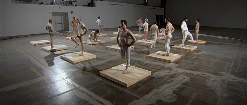
Indeed, the biennial’s video-based works by and large succeeded. Experimentation with the medium itself — for some, the sine qua non of film art — was here restrained. Fans of Stan Brakhage and Company were likely disappointed; a documentary impulse reigned, accompanied by occasional inquiries into spectatorship and the architecture of the viewing experience. Jesse Aron Green animated psychoanalysis’s roots in calisthenics; Rashaad Newsome intervened in the black/Latino/gay choreography of voguing; and Josephine Meckseper filtered the Mall of America through red, white, and blue, accompanied by a deafening and foreboding soundtrack of something like the slowed-down chant of a stoned Gregorian monk. Recalling the primitivism of Bhabha and Houseago, Kelly Nipper replayed a recitation of Mary Wigman’s Witch Dance. With the exception of perhaps Meckseper, these films focused closely on the body in motion and the solo performer; rarely were we distracted by stylistic onanism or overt concern with form. Oddly, “documentary” was very much the prevailing zeitgeist at ‘2010’ — the subject, human.
The small size of ‘2010’ and the show’s lack of bombast have been attributed to the latest recession. In that sense, it was fitting that mere steps from the entrance was a diorama by Daniel McDonald, portraying Charon, the ferryman who escorts newly dead souls to the netherworld in Greek mythology. In the front of his boat, Michael Jackson wielded a large coin to cover the toll, while in the back, Uncle Sam lay flat and flaccid, pockets emptied. It was equally fitting that visible from the diorama was a small placard beside the staircase, describing Michael Asher’s contribution — a plan to keep the biennial open twenty-four hours a day for an entire week. (An addendum noted that, short-circuited by budgetary and human resource constraints, the marathon could last only three days.)
On the top floor of the museum, ‘Collecting Biennials’ openly reflected on the relation between the singular event of the biennial and the march of time. On display were works from the permanent collection featured in previous biennials, and other, non-biennial works from artists who had previously shown there. ‘2010’ may not have represented a watershed — it was too diminutive, too haphazard — but a marked concern for history was everywhere evident. At its best, ‘2010’ articulated a statement about art and its place in the long durée of history — and finally, represented an admirable attempt to capture what literary documentarian James Agee once simply and elegantly referred to as “the cruel radiance of what is.”
